 |
| https://blogger.googleusercontent.com/img/b/R29vZ2xl/AVvXsEgccssthQuhZlvDsNoibpwTMBgCTIQctnnj70bH1JV9DiAD5chgkMO847rA9uDaWkRzh2q4M-Jx0vHOua3rxdcOIvtV8iMA4Y933ycpyZW7NaYGF47U0QCksIDD4E35MQgMem-ThR_aTMkP/s1600/IMG_9847.gif |
Prompt: Create a blog post about your favorite logo(s). Name one brand/logo that you own and enjoy and explain why you think the logo is well designed. Then chose one logo that you are not familiar with from the best logo design links I have below (the first two). Chose one that you think is well designed and explain why.
 |
| http://wallpaper-download.net/wallpapers/logo-wallpapers-apple-logo-desktop-wallpaper-36002.png |
A brand that I own and enjoy is my iphone 5 from the famous company called Apple, their logo is pretty much an apple. (pictured above) I like the logo because I think it is very simple and straightforward. It is not complicated to remember the moment you see the logo, you pretty much know what brand you are talking about. It does not have a lot of words and it is not exactly the most elaborate image but the fact that it is very simple and easy to understand makes it on my list of top logo brands.
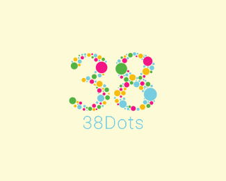 |
| http://logopond.com/members/profile/showcase/106390 |
This is a logo is a logo that I'm not very familiar with but I just think it is very pretty. I like how it keeps with the concept of dots and how it is very eyecatching. Like how Apple's logo, I can get the information on what the logo is about without having to research it. It's very nicely done and I "assume" the designer also used 38 dots to create the logo. I love how the colors are not too contrasting like the bright yellow with black so it gives a very happy and upbeat feel. I like it because it is very well thought out and clearly planned, every step of the design seemed well thought out.
Okay... I don't have anything else to entertain you guys with...
 |
| https://blogger.googleusercontent.com/img/b/R29vZ2xl/AVvXsEiyTF8xgptFfLGOI7ChlTlrGjJhq9SHDSeZ0eeRxrev9e2rXGwmmmtvLbEVbgMGFB9apDjzAVsj-JzIfGu2Gc8LocY9rqJv7CAvQMxnGiKskhzl1bFnZ2icZv_AjxhCi2csJ0TZ9f4DTHn5/s1600/Sad_Dicaprio.gif |
But I have to go now. BYE
See you guys later.


I like the Apple logo too. I feel like it contains a sense of perfection since the shape is symmetrical. You should find out what the 38 dots logo is used for.
ReplyDeleteI agree that the simple apple design is very iconic, and probably why is because of how true the icon is to the name. A picture of an apple to go with the company Apple.
ReplyDelete