 |
| https://d12edgf4lwbh8j.cloudfront.net/photo/image/track_7_5.gif |
So I finally finished my logo project and it was honestly headache inducing so I'm glad it is done! Okay on to the reflection!
What was the most challenging aspect of creating your Logo design?
The most challenging aspect of creating my Logo design has to be just the creation of the layout for my Logo. It was actually one of the worst periods of my whole process. I had graphic designer's block and I pretty much was stuck on this on design and I thought it was perfect but it was incomplete and too simple. It did not really showcase anything special and simply looked as bland as the color white. It did not showcase my skills with the program I was using. The layout was simply a picture and words next to it. I tried to change it but instead of a logo I ended up creating a banner which was not good. It was horrible time period because I never thought it was possible for me to get a block since it never really happened before in the past.
 |
| http://mashable.com/wp-content/uploads/2013/07/crying-waterfalls.gif |
How did you overcome the challenge?
I honestly tried to get feedback from my tablemates but they all just said my design was good. I don't think they were lying but I just don't think they were looking at my Logo with a critic's eyes. I was pretty much stuck in the rut but I managed to overcome it by going back to researching for a while. I looked again at my presentation board to see if anything would pop out and help me. It was a little hopeless at first but my brain started to work again but just to make sure that things were going okay, I bothered my teacher a lot. I had her look at my work to see it as someone who would less likely be biased toward it. She really helped me think outside of my block and see the items I was missing. I know you are reading this Ms. Lee.
 |
| http://media.giphy.com/media/hrBSJ2So6iTo4/giphy.gif |
What was the most successful aspect of your Logo design?
I want to it as a whole was a successful aspect but I think the best part was just the shape and the way I made the words curve to the shape. You will understand when you see my logo. It was nice because I never knew how to do something like that before so this was a next experience but also I was just proud how the design actually looked more professional than before. I'm extremely happy about this.
FINAL PRODUCTS:
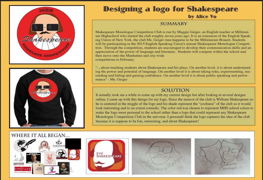

FINAL PRODUCTS:


Yes, I'm always reading.
ReplyDelete